Plot marginal and joint probabilities
(Redirected from Plot marginal and joing probabilities)
Jump to navigation
Jump to search
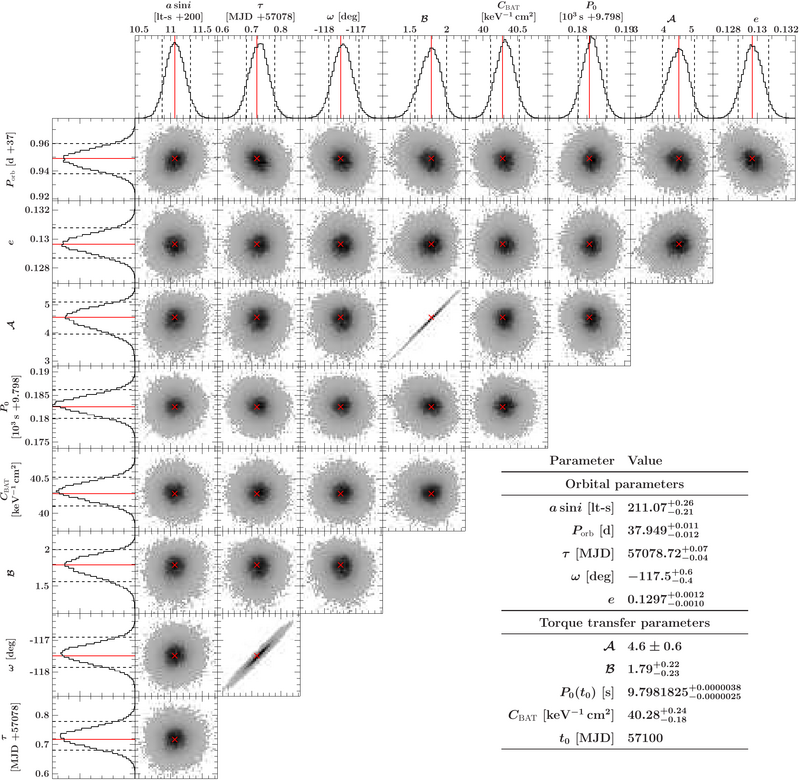
This is just to illustrate how to use the function 'distribution_matrix' and xfig_plot_dstribution_matrix'. I assume you have some data to plot, for example from a monte carlo run or similar:
% Assuming your data is given in a struct as written by the emcee
% routines (so one array for each parameter) given in variable 'data'.

variable matrix = distribution_matrix(data);
% If you only want to include specific struct fields use the qualifier 'fields'.
% The function can also take a number of arrays (of the same length), i.e., the fiels
% of the struct directly.

variable X = xfig_plot_distribution_matrix(matrix);
% If you want to add labels for the plot, add them with the labels qualifiers
% or specifically for each entry with the label# qualifier(s)
% Best fits can be marked with the 'best' qualifier and 'conf' gives you
% the 1d confidence margins. Beware that this takes some assumptions so it might
% not work for your complicated distribution!

variable tex = `
\raggedright
\def\arraystretch{1.5}
\begin{tabular}{rl}
Here could go parameters & values!\\
\end{tabular}
`R;
% This is just a demonstration for how to add a table to the plot

variable info = xfig_new_text(tex);
info.scale(1.3);
info.translate(vector(20, -20, 0));
X.insert(info);
% Scale the table and move it (you could do the math, but testing is simpler)

X.render("matrix.pdf");
