Time Series Analysis
Note: This tutorial is based on the excellent time series tutorial
produced by Tomaso Belloni for the 2010 summer school on
multiwavelength data analysis available at
that school's www page (link at the bottom).
Introduction
In this part of the tutorial, we’ll approach some basic tasks in timing analysis of x-ray time series, with particular emphasis on the typical signals found in the data from Black-Hole Binaries. This document is simply meant to provide rather general guidelines and is not yet intended to be exhaustive.
Specifically, the techniques described below only apply if the time series does not have gaps and is evenly sampled.
Warm-up Exercise
Before jumping to the data, let us start with some simple simulations. We will be using the routines from SITAR, which are part of our standard isisscripts.
We first look at some examples based on a fake data set consisting of a sinusoidal and Gaussian noise.
To generate this example data set, a light curve with a time resolution of 1/1024 seconds and a total length of 16 seconds, use the following code:
variable ti, th, co, omega, period;

% 1024*16 time points from 0 to 16s
variable npt=1024*16;
(ti,th)=linear_grid(0,16,npt);

% our period is 1/100 s
period = 0.01;

variable pi=4.*atan(1.);

% trivial sinus plus a constant
omega=2.*pi/period;
co=10.+sin(omega*ti);

% plot the data
plot(ti,co);

% have a meaningful look
xrange(0,1); plot(ti,co);
In reality, normal data are noisy, so let's add some Gaussian noise with zero average and unit variance:
co=co+grand(npt);
We now produce a power spectrum of our signal co, using intervals of 1024*16 length (i.e. only one interval) with a time resolution of 1/1024:
(f,pa,na,ctsa) = sitar_avg_psd(co,1024*16,1./1024,ti);
Outputs are arrays containing the frequency f, the power pa. and a number containing the number of intervals in the lightcurve that were averaged to reduce the noise, na (in this case 1), and average intensity of the signal, ctsa.
Exercise 1
Without looking, you should be able to guess the first and last values of f and its number of elements. In other words: what is the minimum frequency, what the maximum frequency and how many frequencies do you have? What is the frequency resolution of your power spectrum?
Verify your guesses by examining the array. Do not forget that in slang arrays are zero based.
Plotting the power spectrum should show a peak at 100 Hz
xlabel("Frequency (Hz)");
ylabel("PSD");
% xrange resets the x range to automatic, PSDs are often plotted
% in log log
xrange; xlog; ylog;
plot(f,pa);
The rest is noise. We are not dealing with counting noise here (we simply added some additional noisy signal), so we should not be concerned with the normalization. If you go on a linear frequency axis (xlin) and zoom on the peak at 100 Hz with xrange, you can see that the peak has a width: you should know how broad it is even without looking.
Let us try to reduce the length of the time series by splitting it into shorter intervals (16 intervals of 1 second each) and averaging the resulting power spectra
(f,pa,na,ctsa) = sitar_avg_psd(co,1024,1./1024,ti);
Exercise 2
What are now the minimum and maximum frequency? How broad is the peak now?
The signal we played with until now is too good. Try increasing the amount of noise (for instance, its variance) and see whether you can still detect the signal. It is instructive to have a visual look at the light curves as well: Fourier analysis is a very powerful technique and can pick up signals that are completely invisible by eye.
Exercise 3
Before moving to the real data, play with signals for a bit and get a feeling of what you can do with just a simple power spectrum command such as sitar_avg_psd:
- Try two sinusoids at different periods, harmonically related or not
- Add a phase shift to the sinusoid(s) and compare power spectra
- Try some weird combination of signal and noise
Time Series Analysis with Real Data
We have selected four RXTE data sets to cover typical examples. These data can be downloaded at the WWW pages of ITN 215212. In order to allow you to concentrate upon the timing analysis aspect of the work, we have made available already extracted binned light curves for the four cases:
- bln.lc: An observation of Cygnus X-1 in its Low-Hard State. The short-term time variability is dominated by a number of strong band-limited noise components.
- typec.lc: An observation of XTE J550-564 in its Hard Intermediate State. Here, a strong and narrow Quasi-Periodic Oscillation, with typical frequencies between 1 and 10 Hz is present, together with band-limited noise. The QPO has additional harmonic peaks.
- typeb.lc: An observation of GX 339-4 in its Soft Intermediate State. The power density spectrum is dominated by the presence of a strong 4-8 Hz QPO, accompanied by a power-law noise. The QPO has additional harmonic peaks and jitters on a time scale of about 10 seconds.
- hfqpo.lc: An observation of GRS 1915+105 where a high-frequency QPO is detected. These oscillations are weak and elusive. This is the best case ever, so that detection should not prove to be a problem.
Low-Hard State
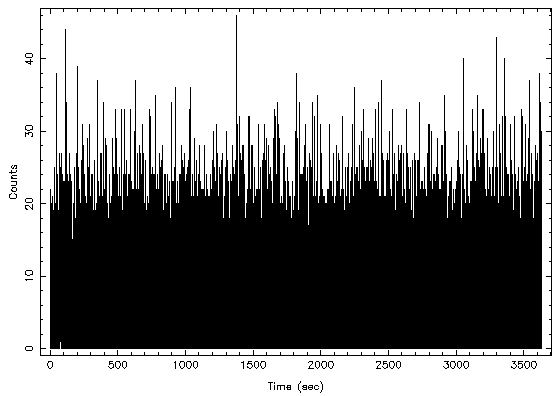
Before moving to the frequency domain with a power spectrum, let us have a look at the raw data and see what the light curve looks like. The time resolution of this curve is 1.953125 ms, corresponding to 512 bins per second. The total length is 3634 seconds, just over one hour. We can load the data and convert the number of counts to integer (to speed up the FFT and save memory) with
(ta,ca) = fits_read_col("bln.lc","time","counts");
ca = typecast(ca,Integer_Type);
Time to plot your light curve
xlabel("Time (sec)");
ylabel("Counts");
plot_bin_integral;
xlin; ylin;
xrange; yrange;
plot(ta-ta[0],ca);
It is difficult to see much at this high time resolution. Zooming on the first 10 seconds
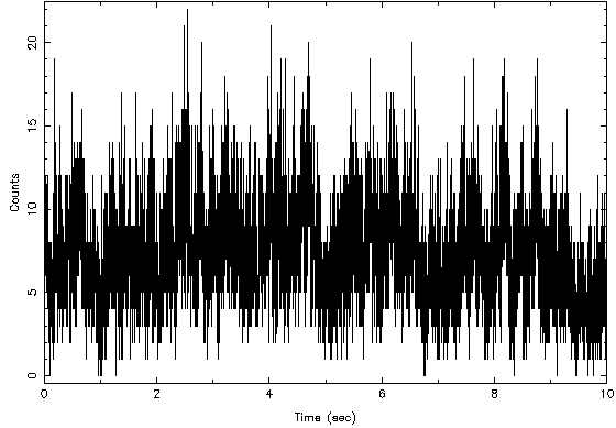
xrange(0,10);
reveals some structure, but there are so few counts in each bin that one can see the jumps between integers. At any rate, the data are quite variable, as expected:
Let move to the frequency domain and produce a power spectrum. We’ll calculate a PSD for each 16s interval and then average the PDS together
(f,pa,na,ctsa) = sitar_avg_psd(ca,8192,1./2^9,ta);
here ca is the time series, 8192 is the number of points per data interval (i.e. 16 seconds at 512 pps), 1./2^9 is the time resolution and ta are the times for the bins, so that gaps can be taken care of. There should not be any gap here. Plotting the PSD is not particularly enlightening
xlabel("Frequency (Hz)");
ylabel("PSD");
% remember we limited the X axis between 0 and 10, so we need
% to reset the range
xrange;
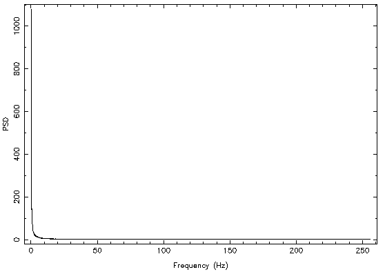
plot(f,pa);
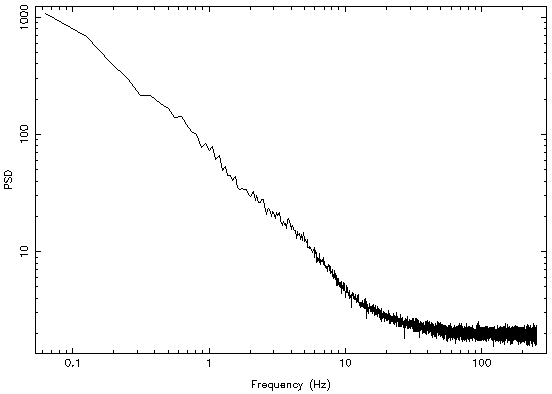
Plotting in loglog seems to be a much better idea
xlog; ylog;
plot(f,pa);
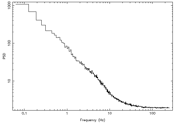
Some rebinning is in order. A logarithmic rebinning with a factor of 1%, meaning that each frequency bin is 1% broader than the previous one, leads to a much more satisfying result
(aflo,afhi,apsd,nf) = sitar_lbin_psd(f,pa,0.01);
hplot(aflo,afhi,apsd);
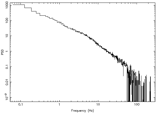
The flattening at high frequencies is due to the Poissonian noise, which should be at an average level of 2 but is modified (lowered) by the effects of detector dead time. The two possible courses to follow in order to remove it from the data are to estimate it through the available models or to fit it with a constant value. Then subtract (see below). Just to have a look, let us pretend it is exactly at 2 and subtract it
dumpsd = apsd - 2.0;
hplot(aflo,afhi,dumpsd);
The full shape of the PDS is now clearly visible.
In order to extract useful information, we must fit this PSD with a
suitable model. First we must assign the PDS as a fittable data set,
with errors (power/sqrt(number of average):
variable id = sitar_define_psd(aflo,afhi,apsd,apsd/sqrt(na*nf));
This convinces isis that the PSD is really an (energy) spectrum, with frequencies taking the place of energy. This means that all spectral models available in isis can be used to fit the data.
If needed, we can restrict the fittable part of the PDS to a range of frequencies, say 0.1 to 100 Hz (although 10 Hz would be a better limit!)
xnotice_en(id,0.1,100);
Now we define a suitable model for the fit as a constant (for the Poisson noise) and two zero-centered Lorentzians for the source intrinsic noise
fit_fun("constant(1)+zfc(1)+zfc(2)");
set_par("constant(1).factor",1.99);
notice the value lower than 2!
set_par("zfc(1).norm",100);
set_par("zfc(1).f",8);
set_par("zfc(2).norm",50);
set_par("zfc(2).f",0.8);
Now we can renormalize to the integral, to help the fit, and try a fit
() = renorm_counts;
() = fit_counts;
Looking at the parameters gives you some feeling what is going on:
isis> list_par;
constant(1)+zfc(1)+zfc(2)
 idx  param           tie-to  freeze         value         min         max
  1  constant(1).factor   0     0         1.912599           0       1e+10
  2  zfc(1).norm          0     0           7.5585           0       1e+08  rms
  3  zfc(1).f             0     0         3.689417       1e-06        1000  Hz
  4  zfc(2).norm          0     0         10.97784           0       1e+08  rms
  5  zfc(2).f             0     0        0.2474409       1e-06        1000  Hz
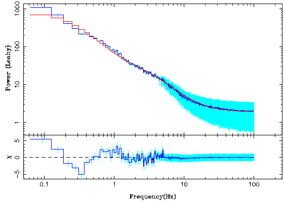
We need to plot the fit to see how things are going. To make the plots nice, let us define a plot structure for the plotting routines:
set_plot_widths(;d_width=3, r_width=3, m_width=3, de_width=1,re_width=1);
set_frame_line_width(3);
charsize(1.12);
fancy_plot_unit("psd","psd_leahy");
popt.dsym=0;
popt.dcol=4;
popt.decol=5;
popt.rsym=0;
popt.rcol=4;
popt.recol=5;
popt.xrange={0.05,256};	 % X range: not necessary, but you can see how we do it
popt.res=1; % Plot also residuals
and then plot the resulting fit:
plot_counts(id,popt);
The fit could be better, but for the moment we will ignore this. For now, let us be content with the result and estimate some error on the parameters in the same way we would also do this for a spectrum:
(,) = conf_loop([1:5];save,prefix="first_bln.");
() = system("more first_bln.save");
In case you want to start from scratch, you can delete all data and restart
delete_data(all_data);
Exercise 4
Now you can try to do more. For instance:
- Add another zero-centered Lorentzian component to the fit and see if it gets any better.
- It is difficult to see how the model is doing even with the residuals. Try to restrict the fit to the high frequency part, say above 100 Hz, where Poissonian noise dominates. Fit this area with a constant and then subtract it from your data and go on without Poisson noise.
- Produce power spectra extending to lower frequencies to see how the noise flattens. Can you also extend it to higher frequencies?
- Divide the data in more than one segment and see whether there are differences between the segments.
- Can you calculate the integrated fractional rms of the different components? What do you need to do that?
Exercise 5
In order to get more of a feeling for what is going on in the data, try your hands on one of the following sections
Type-C Quasi-Periodic Oscillation
Here you encounter a low-frequency QPO in addition to band-limited noise.
- Extract the light curve and have a look. Does it look any different from the previous one?
- Extract the power spectrum and see the QPO. How many noise components and how many QPO peaks do you think you will need? Always better to start with an underestimate and add as you go. The model to use for a QPO in isis is, not surprisingly, called qpo. Its parameters are the norm, Q, and f. They correspond to normalization, quality factor (centroid divided by FWHM of the peak) and centroid frequency.
- Do you see any differences in PDS taken at different times?
- Can you calculate the integrated fractional rms of the different components? What do you need to do that?
Type-B Quasi-Periodic Oscillation
Yet another low-frequency QPO on top of some power-law noise
- Extract the light curve, as usual. Do you see some section which is different from the others?
- Produce the power spectrum and have a look. Does the peak look like a Lorentzian? Try fitting. You can use a powerlaw (model powerlaw) for the continuum. See whether this is sufficient. Does a Lorentzian model work for the QPO? You might want to try a Gaussian (gaussian).
- Extract a power spectrum from the first 120 seconds of observation. What does the QPO look like here? Compare it with any other 120 s interval.
- Try to follow the QPO on higher time scales, a few seconds.
- Determine the fractional rms of the components.
High-frequency Quasi-Periodic Oscillation
Here we move to higher energies. The source, GRS 1915+105, is also pretty weird. A light curve will produce some interesting plots.
- Produce a power spectrum and concentrate on frequencies above 10 keV, away from the messy part. That’s where the important signal lies.
- Fit the HFQPO and get its parameters. Is it significant? At what confidence level?
- How strong (in fractional rms) is the oscillation?
